What is Donut Chart?
Donut chart (pie chart with hollow center) shows part-to-whole relationships as colored segments. Percentage of total displayed as circular slices. Hollow center often shows total value or primary metric. Include legend with labels and percentages. Use distinct colors for each segment. Hover to highlight segment and show tooltip.
When Should You Use This?
Budget breakdowns, traffic source distribution, market share, expense categories. Best for 3-6 segments (too many becomes unreadable). Use when you need to show how parts contribute to a whole. Alternative to pie chart—donut looks more modern and center space is useful for total or metric.
Common Mistakes to Avoid
- •Too many segments—limit to 6 max, group small slices into "Other"
- •No legend—always show labels and percentages for each segment
- •Similar colors—use distinct, contrasting colors for adjacent segments
- •Missing total—use center to show total amount or primary metric
Real-World Examples
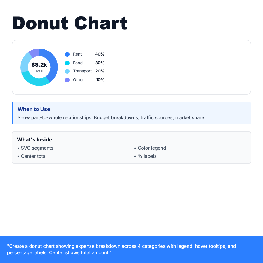
- •Budget app—expense breakdown by category (rent 40%, food 30%, transport 20%, other 10%)
- •Google Analytics—traffic sources (organic 45%, direct 30%, social 15%, referral 10%)
- •Portfolio—asset allocation (stocks 60%, bonds 30%, cash 10%)
Category
Data Visualization
Tags
donut-chartpie-chartproportionalpercentagecircularbudgetdata-viz