What is Progress Ring?
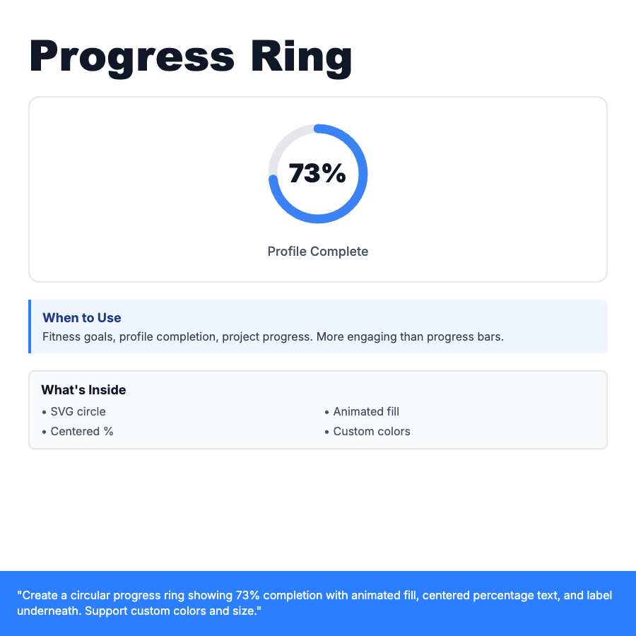
Progress ring (radial/circular progress bar) shows percentage completion as a partial circle stroke. SVG-based with animated fill. More visually engaging than linear progress bars. Popularized by Apple Watch fitness rings. Shows centered percentage text and optional label underneath. Supports custom colors and sizes.
When Should You Use This?
Fitness/health goals, profile completion, project milestones, skill mastery, course progress. More engaging than standard progress bars. Use when you want to highlight completion in limited space. Works well in cards or as standalone widgets. Consider multiple rings (nested) for related metrics (like Apple fitness rings).
Common Mistakes to Avoid
- •No animation—ring should smoothly fill to percentage on load
- •Unclear label—always show what the percentage represents
- •Too many rings—limit to 1-3 nested rings max for clarity
- •Missing accessibility—include aria-label with percentage and label text
Real-World Examples
- •Apple Watch—fitness rings for Move, Exercise, Stand goals
- •LinkedIn—profile completion with ring showing % complete
- •Learning apps—course progress, skill mastery rings
Category
Data Visualization
Tags
progress-ringcircular-progressradial-progresscompletionpercentagedata-viz