What is Comparison Dashboard?
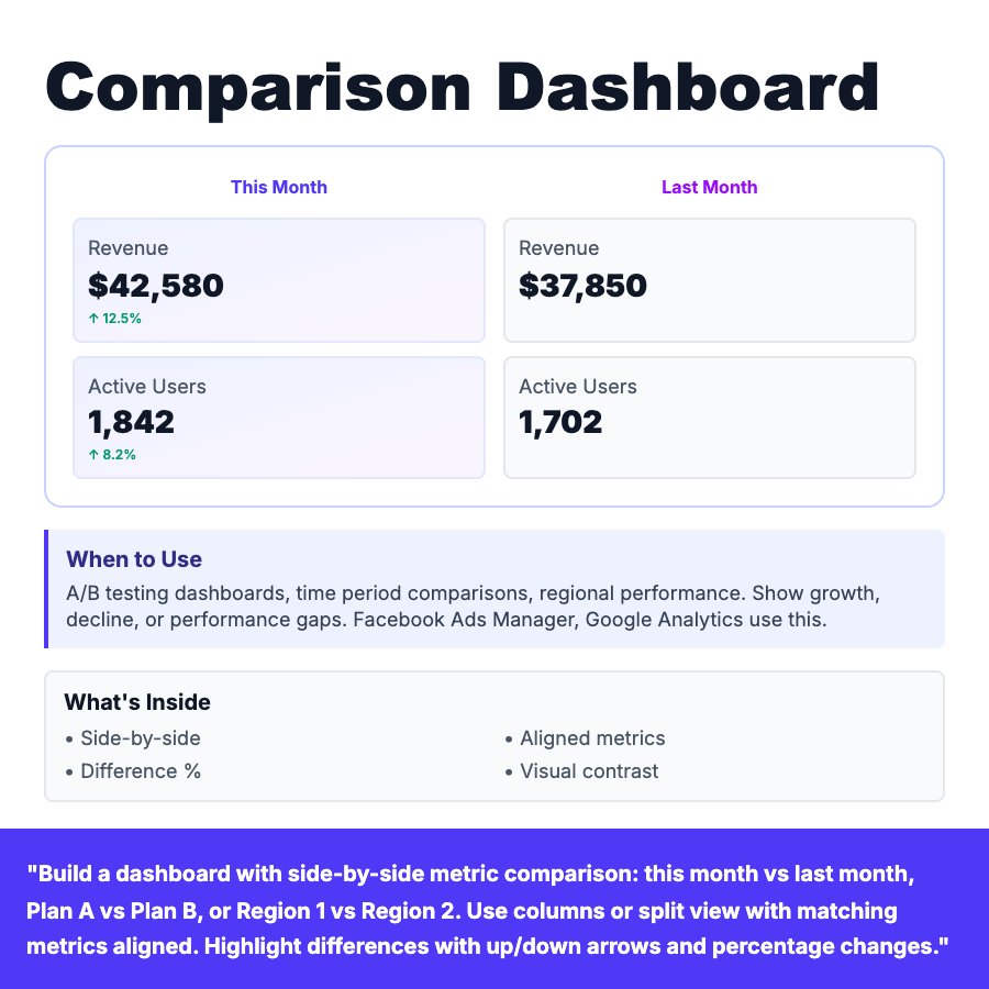
Comparison dashboard shows metrics side-by-side for comparison: this month vs last month, Plan A vs Plan B, Region 1 vs Region 2. Uses aligned columns or split view with matching metrics in same order. Highlights differences with up/down arrows, percentage changes, and visual contrast. Common in A/B testing and analytics platforms.
When Should You Use This?
A/B testing dashboards, time period comparisons (month-over-month, year-over-year), regional performance, plan comparisons. When users need to identify growth, decline, or performance gaps. Use matching metric order and visual alignment for easy scanning. Good for showing before/after or treatment/control results.
Common Mistakes to Avoid
- •Misaligned metrics—same metrics must line up vertically
- •No difference indicators—show % change and arrows
- •Too many comparison points—limit to 2-3 columns max
- •Missing context—label what's being compared clearly
Real-World Examples
- •Facebook Ads Manager—Campaign A vs Campaign B performance
- •Google Analytics—This month vs last month traffic comparison
- •Optimizely—A/B test variant comparison with statistical significance
Category
Dashboard Patterns
Tags
comparisonside-by-sideab-testingtime-comparisonsplit-viewmetrics