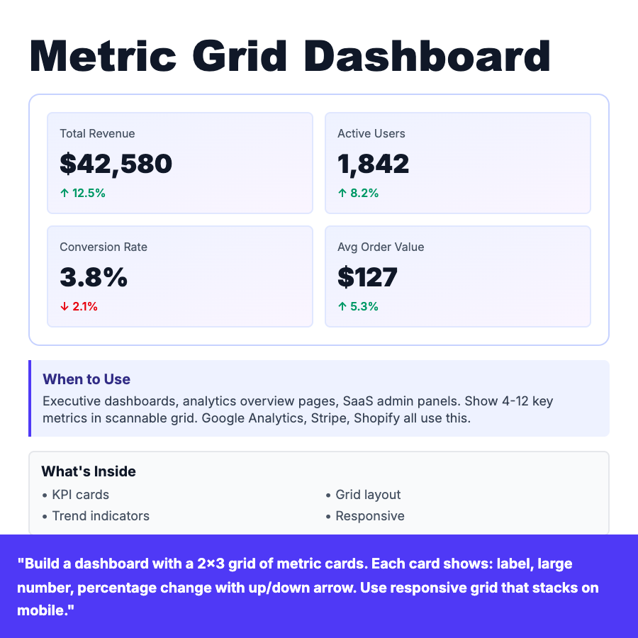
What is Metric Grid Dashboard?
Metric grid dashboard displays key performance indicators in a responsive grid of cards. Each card shows a metric label, large number, trend indicator (up/down arrow), and percentage change. Commonly arranged in 2x2 or 3x4 layouts. Stacks vertically on mobile. Used by Google Analytics, Stripe, Shopify for executive overviews.
When Should You Use This?
Executive dashboards, analytics overview pages, SaaS admin panels. Show 4-12 key metrics in scannable grid layout. Use when users need at-a-glance status of multiple metrics without drilling down. Group related metrics together (revenue metrics, user metrics, performance metrics).
Common Mistakes to Avoid
- •Too many metrics—limit to 12 max, prioritize most important
- •Inconsistent card sizes—use uniform heights for visual harmony
- •No trend indicators—always show if metric is up/down
- •Missing responsive behavior—grid should stack on mobile
Real-World Examples
- •Google Analytics—Overview dashboard with sessions, bounce rate, conversion
- •Stripe—Revenue overview with MRR, active subscriptions, payment volume
- •Shopify—Store dashboard with orders, sales, visitors, conversion rate
Category
Dashboard Patterns
Tags
metric-gridkpi-dashboarddashboard-layoutanalyticsoverviewgrid