What is Funnel Chart?
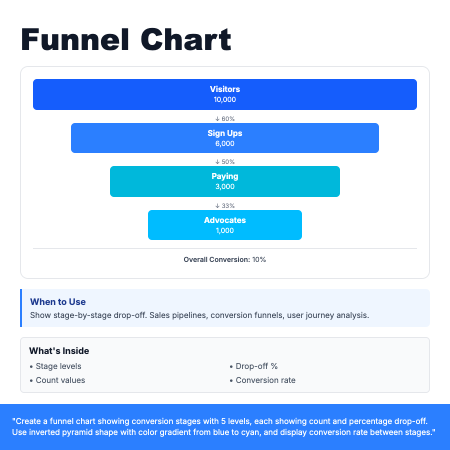
Funnel chart displays stage-by-stage progression with decreasing width representing drop-off at each step. Shaped like inverted pyramid—widest at top (initial stage), narrowest at bottom (final conversion). Shows count and percentage at each stage, with conversion rate between stages. Essential for identifying bottlenecks in user flows.
When Should You Use This?
Sales pipelines (leads → qualified → demo → proposal → close), e-commerce checkout (cart → shipping → payment → confirmation), user onboarding (signup → profile → tutorial → first action), marketing campaigns (impressions → clicks → signups → purchases). Use to identify where users drop off.
Common Mistakes to Avoid
- •Missing percentages—show both count and % drop-off at each stage
- •Too many stages—limit to 5-7 steps for clarity
- •No labels—clearly name each stage in the funnel
- •Wrong order—stages must be sequential (top to bottom)
Real-World Examples
- •E-commerce—10k visitors → 6k signups → 3k cart → 1k checkout → 200 purchased
- •SaaS onboarding—5k signups → 3k verified → 1.5k completed profile → 500 activated
- •Lead gen—50k ad impressions → 5k clicks → 500 form fills → 50 qualified leads
Category
Data Visualization
Tags
funnel-chartconversion-funnelsales-funnelpipelinedrop-offjourneydata-viz