What is Heat Map?
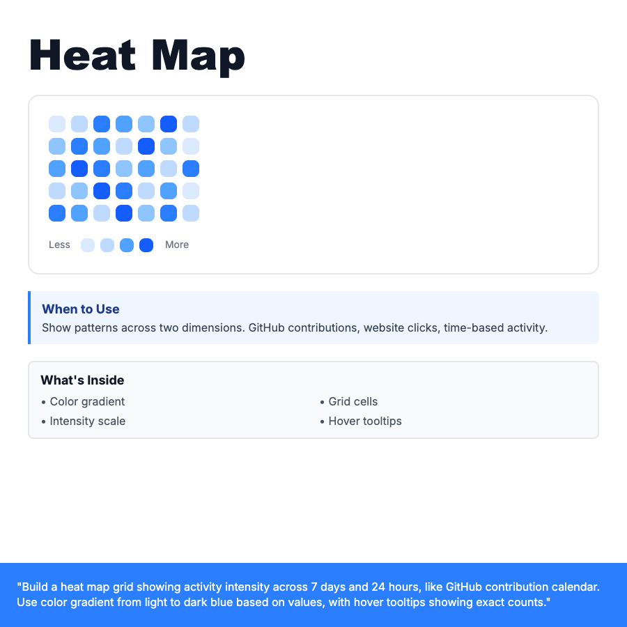
Heat map is a color-coded grid visualization where cell color intensity represents data values across two dimensions. Uses gradient from light to dark (or color spectrum) to show patterns and hotspots. Common in GitHub contribution calendars, website click maps, and time-based activity tracking. Hover shows exact values.
When Should You Use This?
Activity patterns over time: GitHub contributions (day × week), website click tracking (page section × time), sales heat (product × region), time-based engagement (hour × day). Best for spotting patterns, clusters, and anomalies in large datasets with two categorical dimensions.
Common Mistakes to Avoid
- •Too many cells—keep grid manageable (max 7×24 for readability)
- •Poor color choice—use sequential gradient, not random colors
- •No legend—always show color scale with value ranges
- •Missing tooltips—add hover state showing exact values
Real-World Examples
- •GitHub—contribution calendar showing commits per day over a year
- •Website analytics—click heatmap showing where users click most
- •E-commerce—sales performance grid (product category × time of day)
Category
Data Visualization
Tags
heat-mapheatmapgridintensitycolor-codedactivitydata-viz