What is Scatter Plot?
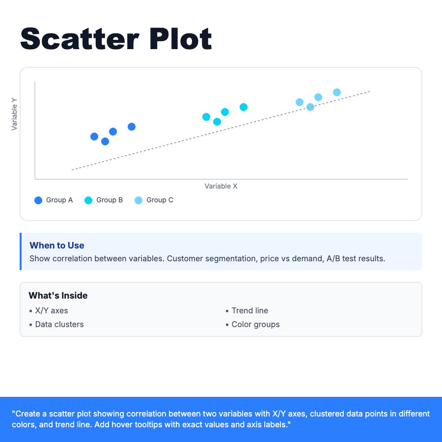
Scatter plot displays data points on X/Y axes to show correlation between two variables. Points cluster to reveal patterns—positive correlation (upward trend), negative correlation (downward), or no correlation (random scatter). Add trend line to highlight relationship. Use color to group different data sets or categories.
When Should You Use This?
Correlation analysis: price vs. demand, study time vs. grades, marketing spend vs. revenue, customer age vs. purchase frequency. Best for identifying relationships, outliers, and clustering in continuous data. Use when you need to see if two variables are related.
Common Mistakes to Avoid
- •No trend line—add regression line to show overall correlation
- •Too many points—consider opacity or sampling for large datasets
- •Unlabeled axes—always show X/Y variable names and units
- •No grouping—use color to distinguish different categories or segments
Real-World Examples
- •E-commerce—price vs. sales volume to find optimal pricing
- •Fitness app—workout duration vs. calories burned correlation
- •Marketing—ad spend vs. conversions with different campaign colors
Category
Data Visualization
Tags
scatter-plotscatter-chartxy-plotcorrelationtrend-lineanalysisdata-viz