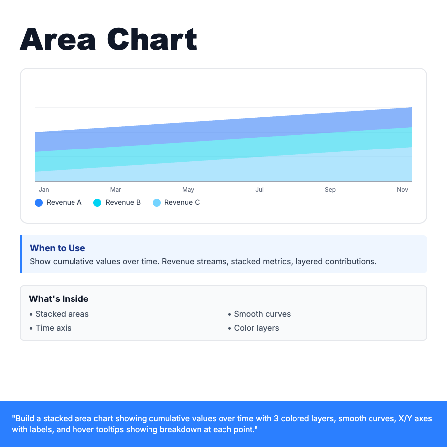
What is Area Chart?
Area chart is a line chart with filled areas below the line, showing cumulative values over time. Stacked version displays multiple data series as layered colored areas, revealing both individual contributions and total sum. Use smooth curves for aesthetic appeal. Each layer shows a metric, with total height representing combined value.
When Should You Use This?
Revenue breakdowns over time (product lines stacked), traffic sources (organic + paid + referral), resource usage (CPU + memory + disk), budget allocation tracking. Best for showing how parts contribute to whole over time. Use when you need both individual trends and total sum.
Common Mistakes to Avoid
- •Too many layers—limit to 3-5 stacked areas for readability
- •No legend—always label each area with color key
- •Wrong order—stack most important/stable metrics at bottom
- •Missing tooltips—add hover showing breakdown at each time point
Real-World Examples
- •SaaS dashboard—MRR breakdown by plan tier (Basic + Pro + Enterprise)
- •Google Analytics—traffic sources stacked over time
- •Finance app—income streams (salary + investments + side business)
Category
Data Visualization
Tags
area-chartstacked-areacumulativefilled-charttime-seriesrevenuedata-viz