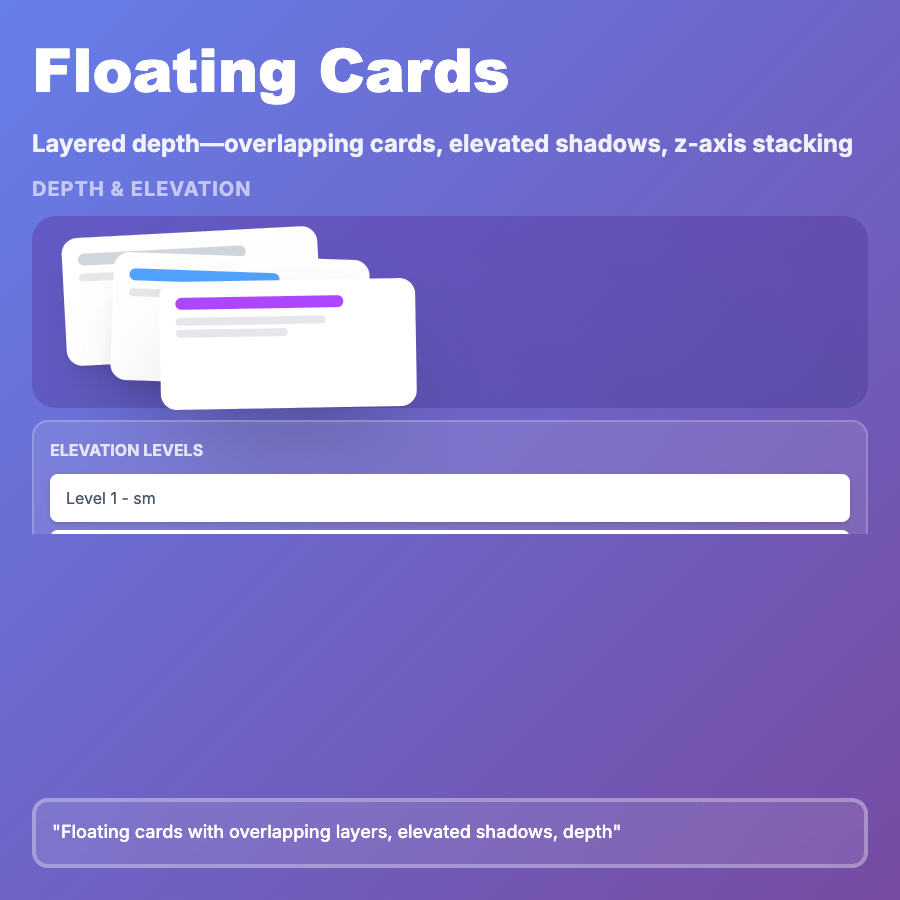
What is Floating Layout?
Floating Layout centers primary content in viewport with subtle backdrop (often gradient or blur)—creating focused, modal-like experience without actual overlay. Content appears to "float" above background, directing attention to single task or form. Common in authentication flows, onboarding, checkout processes, and single-task focused interfaces where minimizing distraction is critical.
When Should You Use This?
Use floating layout for login and signup pages, onboarding flows and setup wizards, checkout and payment forms, survey and questionnaire interfaces, and focused task flows (file upload, settings). Choose this when single task deserves full attention and environmental distractions should be minimized.
Common Mistakes to Avoid
- •Too much backdrop—dark overlays can feel claustrophobic; use subtle backgrounds
- •Missing escape—no clear way to dismiss or navigate away frustrates users; provide exit route
- •Poor mobile adaptation—floating cards often too large for mobile; adjust sizing
- •No context—users lose sense of where they are in app; provide breadcrumbs or progress indicators
- •Accessibility issues—focus trapping may not work correctly; implement proper focus management
Real-World Examples
- •Linear—onboarding uses floating cards with subtle gradient backdrop for setup flow
- •Stripe—payment form floats centered with blurred background for focused checkout experience
- •GitHub—authentication pages use floating centered card with subtle background gradient
- •Notion—workspace creation uses floating modal-style interface for focused setup
Category
Layouts
Tags
floating-layoutcentered-layoutmodal-layoutfocused-uisingle-task