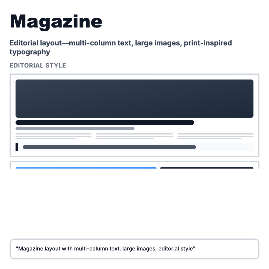
What is Magazine Layout?
Magazine Layout applies editorial design principles to web—large hero images, varied typography hierarchy, asymmetric composition, pull quotes, and generous whitespace. It prioritizes storytelling and reading experience over strict grid uniformity. Common in blogs, online publications, portfolios, and marketing sites where content quality and presentation drive engagement.
When Should You Use This?
Use magazine layout for long-form blogs and articles (Medium, Substack), online magazines and publications, agency portfolios and case studies, product storytelling pages, and annual reports or brand books. Choose this when content quality is exceptional and deserves elevated presentation that encourages deep reading.
Common Mistakes to Avoid
- •Overdoing it—too many design flourishes distract from content; restraint is key
- •Poor reading experience—fancy layouts that hurt legibility defeat purpose; prioritize readability
- •Inconsistent style—mixing too many layout patterns within article; establish consistent system
- •Mobile neglect—complex layouts often break on mobile; simplify for smaller screens
- •Missing typography hierarchy—magazine layouts need clear heading/body distinction; use scale intentionally
Real-World Examples
- •Medium—article pages use large hero image, generous margins, pull quotes, and varied typography
- •Stripe Press—book pages use magazine-style layout with large imagery and editorial typography
- •The Verge—article pages combine large imagery, varied widths, and pull quotes for editorial feel
- •Apple Newsroom—press releases use magazine layout with hero images and multi-column text blocks
Category
Layouts
Tags
magazine-layouteditorial-designcontent-layoutblog-layoutstorytelling